Categorizing Campaigns in Neverwinter
Neverwinter is a free to play massively multiplayer online roleplaying game that was launched in 2013. That longevity means that the game has needed to constantly change and grow to meet the expectations of the players. It also means that new players' experience must constantly be balanced with the end-game players' experience, as the end-game is also becoming more and more complicated.
Campaigns are essentially flow charts of tasks and rewards, and are a way to provide an overplot for quests and to introduce new zones, critters and sometimes systems in a way that makes sense with the game and setting. Over the years, the game has settled into a cadence of a new module including a new campaign.
However the designers wanted to address the problem of players rushing through the entire module content very quickly and having nothing to do until the next module. Repeatable content is one way to solve this, but "grinding" isn't anyone's favourite part of a game. The system designers proposed having three smaller campaigns in a module, each time gated so that it could not be started until you'd finished the previous campaign and a certain date had passed. The challenge then was how to present these campaigns as part of a group, without bloating the campaign list and making it harder to navigate.
Please note that I created none of the actual art assets shown here, only the wireframes/low fidelity prototypes.
Original UI
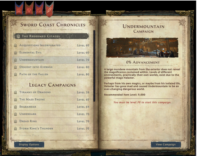
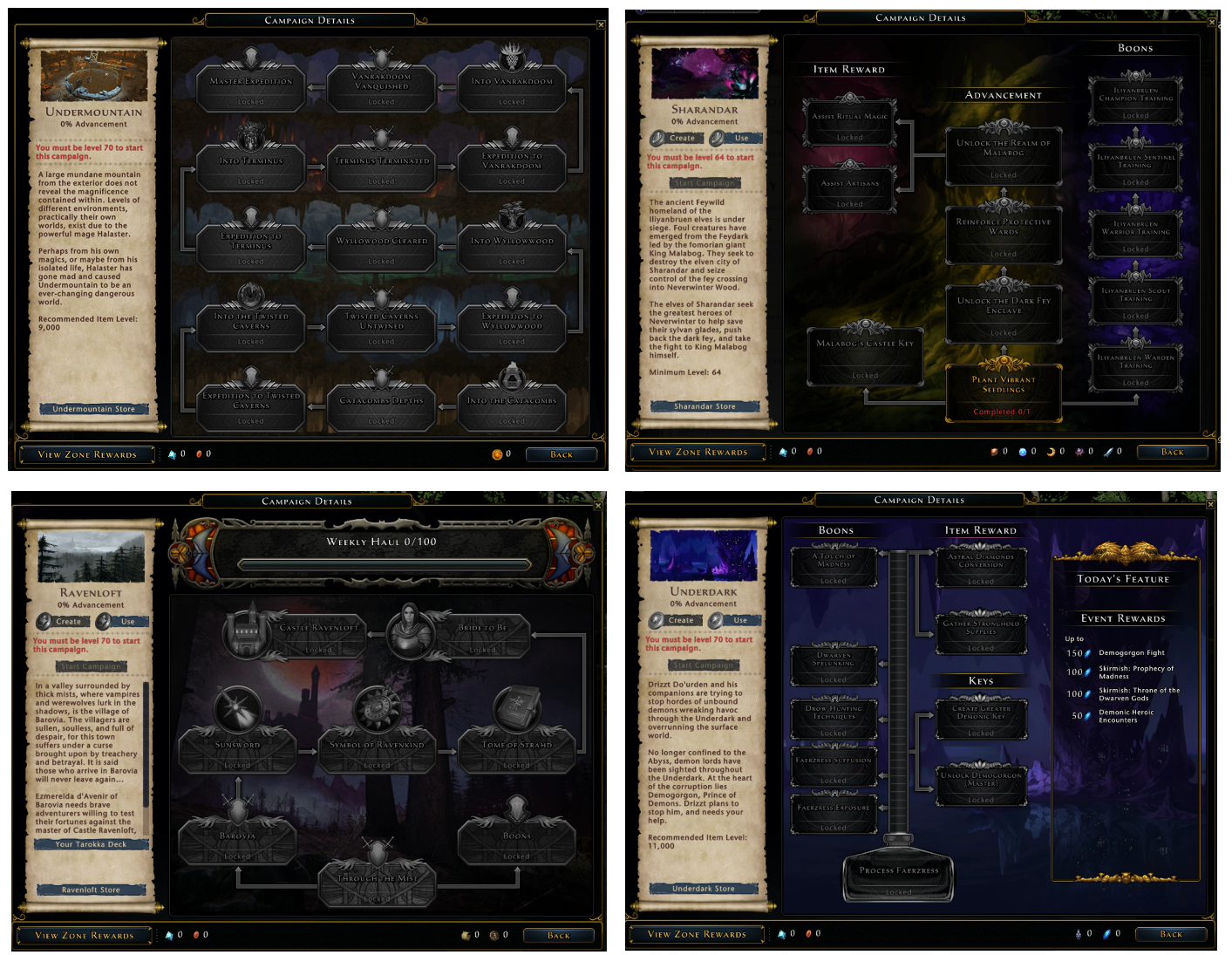
Until this point, campaigns were just added to the top section of the Sword Coast Adventure list as they were launched. When one campaign was added, the oldest campaign in the top section was moved down to the "Legacy Campaign" section at the bottom. Also, each campaign design and UI had been very distinctive and different from any other campaign. Designing and implementing the unique campaign UI was a major part of each module's work.
If three campaigns were just created per module instead of one, with nothing else changing, then the following problems occurred:
- Vertical space was at a premium (especially on console) and adding three or more campaigns per module would quickly make the list difficult to navigate.
- In the list, it might be difficult to tell which campaigns belonged to which module.
- Making three unique campaign UIs instead of one would triple the work per module, at a time when the team size was reducing and we needed to become more efficient.
Solution
In order to implement campaigns more efficiently, and also to let system designers immediately see the campaign data in the game rather than have to wait for the UI implementation, we agreed to use a new template that all future campaigns would follow. We also needed a way to display all a module's campaigns so that their connection was clear, but without taking too much space in the list.
Individual Campaign Details
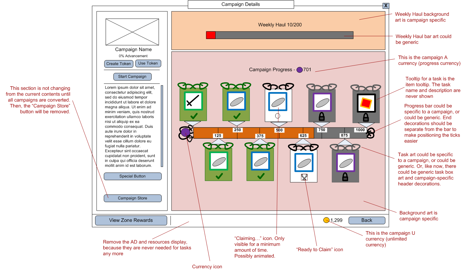
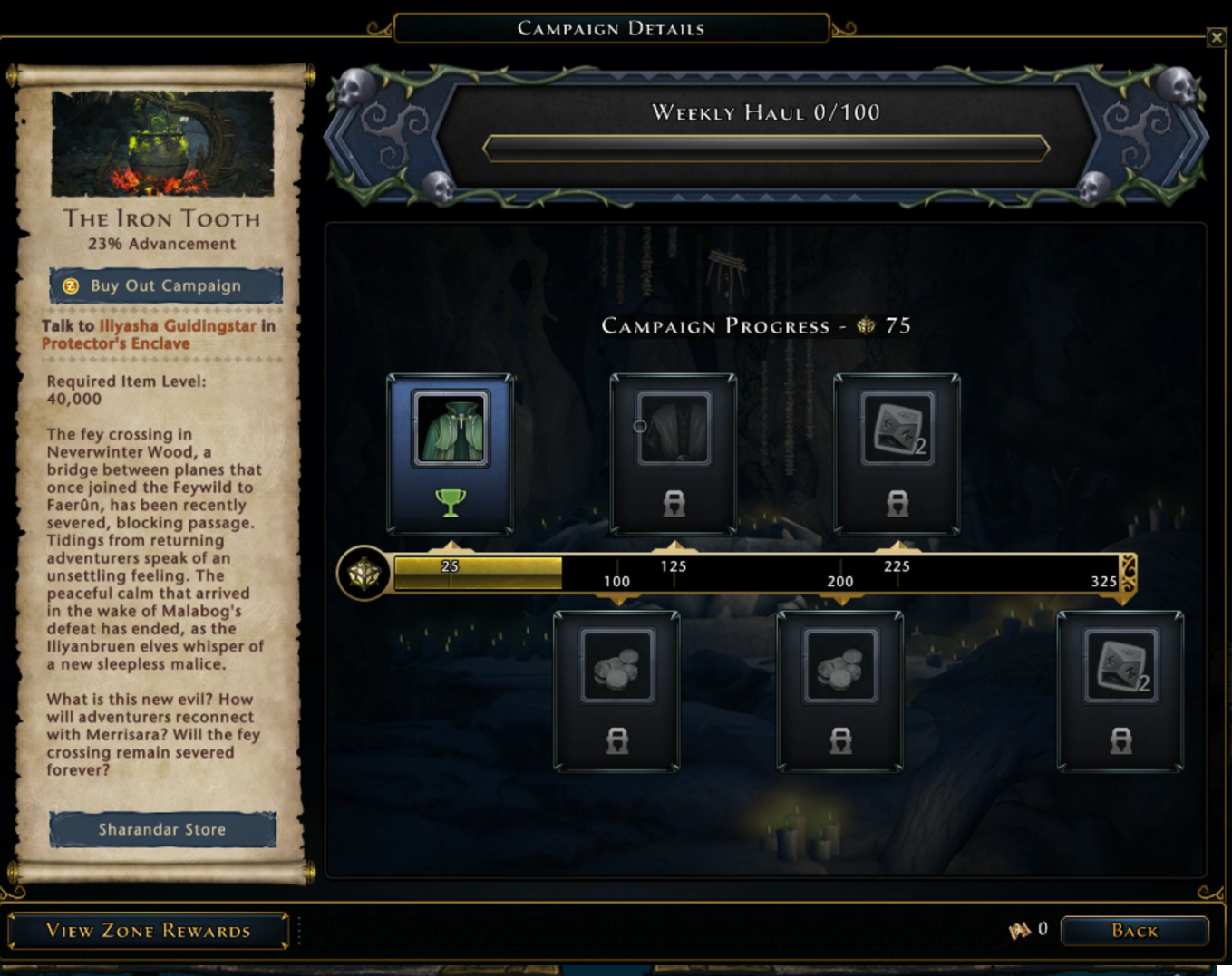
The system designers came up with a structure for campaigns that was a simple progression bar with milestone tasks. The only difference between campaigns would be the spacing and number of the tasks and the rewards they gave. As a player got the progression numeric, tasks unlocked and the player could claim the rewards. To control progress even more, we retained the "Weekly Haul" cap where you could only make a certain amount of progress per week.
To keep some flavour of the module, we wanted to still have some unique art per campaign. But by keeping the layout the same in all cases, creating the art took far less time.
Campaign Grouping
Once the basic format of the individual campaigns was agreed upon, there was the question of how to show the three (possibly more) module campaigns. The initial exploration was to show them all together in one window, so that the module could have a single entry in the journal list.
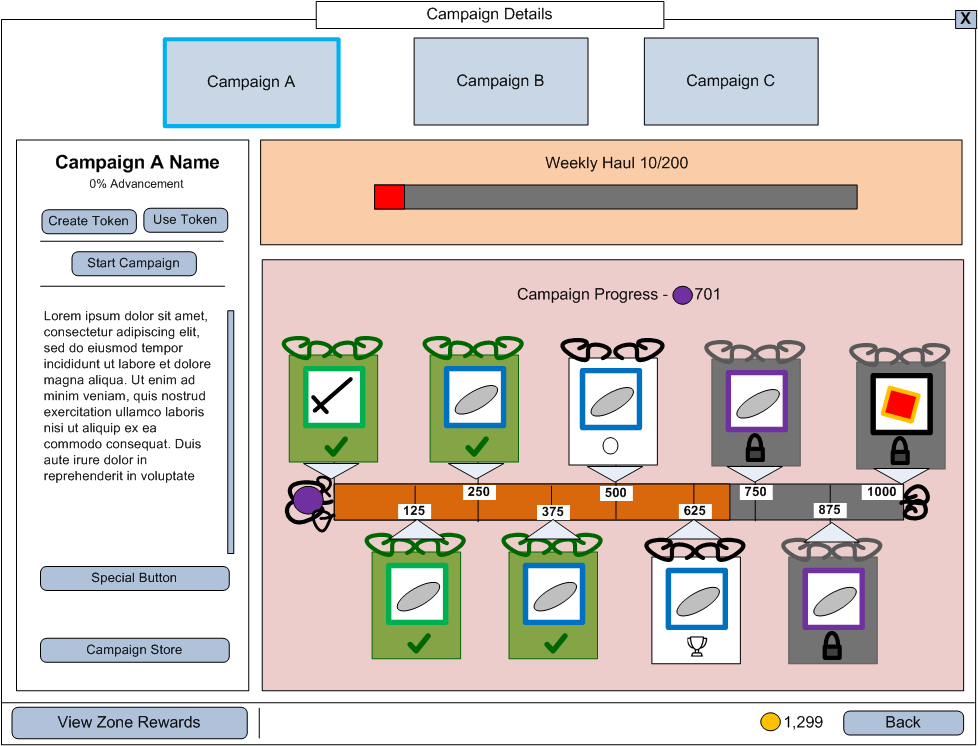
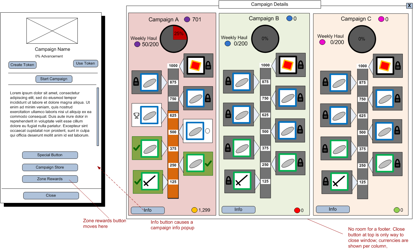
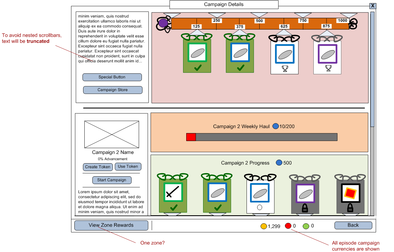
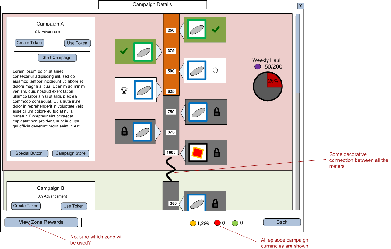
However all these ideas were quickly determined to be too cluttered, require too much time from art, and did not support more than about three campaigns easily. Quickly iterating on wireframes can get answers like this without the effort of high fidelity mockups.
We had decided to keep the individual campaign detail window, which meant that the campaign grouping needed to be displayed in the journal. Rather than completely recreate the journal in wireframe form, I used screenshots and added wireframe elements to indicate the changes to create a higher fidelity prototype than wireframes, but not using final art.
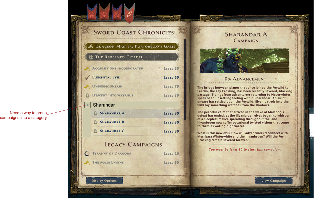
This option has positive transference with the rest of the journal (the other tabs also use collapsing/expanding headers in lists). It also keeps the right side of the window the same as always; the information about a single campaign is shown, with the "View Details" opening the actual campaign window.
However, the collapsing area takes up an extra line with the header.
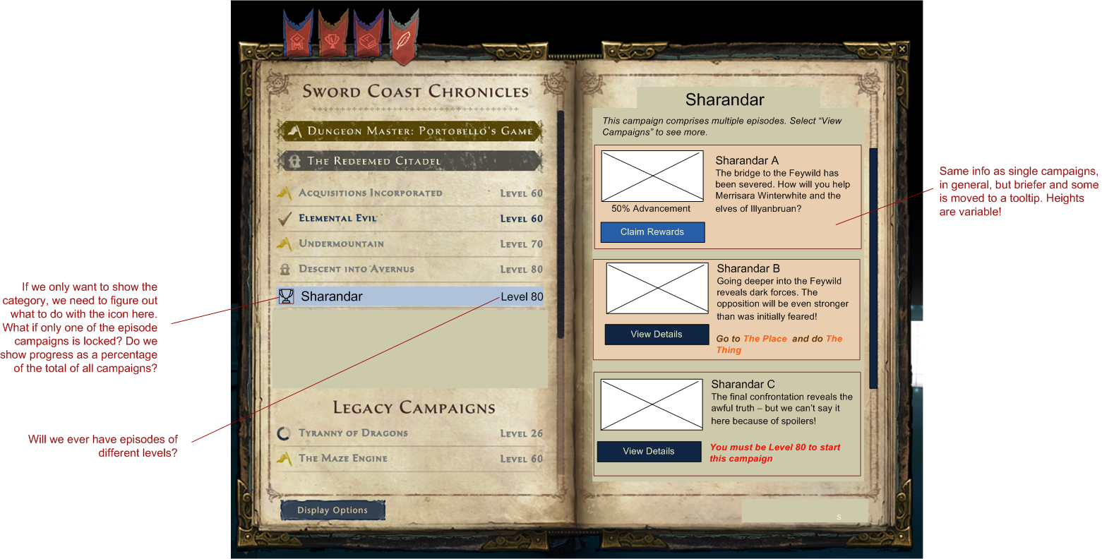
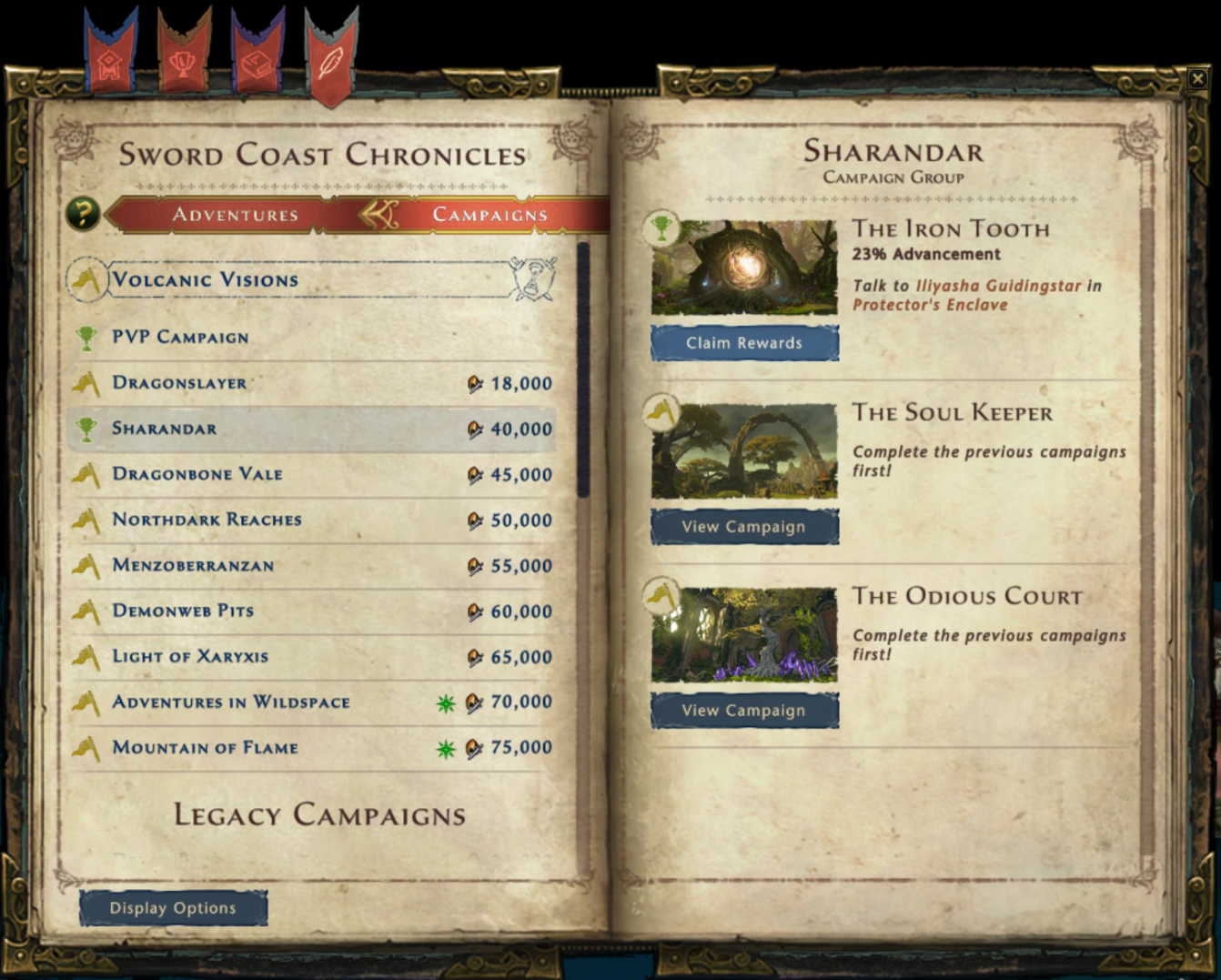
In this option, all the individual campaigns are moved to the right-hand pane. Only the module category is selectable in the left list. The right-hand pane shows a reduced version of the current campaign details view, for each individual campaign. This shows the campaigns in a set all together so that their unlock and progression information can all be seen at once.
After discussion, the second option, with the new right-hand pane, was selected. The wireframes went to the UI artist who created the in-game art and then back to me to implement.
Conclusion
The goal of having all new campaigns use the same template lasted for exactly one module before individual module functionality started creeping back. We added a module-specific area under the main progress bar to handle this information as needed. The total time to implement a campaign is still shorter than it was.
