The Evolution of Neverwinter's Enchantment Refinement
Neverwinter is a free to play massively multiplayer online roleplaying game that was launched in 2013. That longevity means that the game has needed to constantly change and grow to meet the expectations of the players. It also means that new players' experience must constantly be balanced with the end-game players' experience, as the end-game is also becoming more and more complicated.
This describes the evolution of equipment enchantment, one way that the game allows customization and strategy as players become ready for it. In the original design, starting equipment could not hold enchantments. As players became more familiar with the game they gained equipment that could have "enchantments" slotted, which customized powers and increased damage. The enchantments could be refined and upgraded to make them more powerful.
This is still broadly the case in the game, but the details of upgrading enchantments changed. As the functionality changed, so did the UI and UX.
Please note that I created none of the actual art assets shown here, only the wireframes/low fidelity prototypes.
Original UI
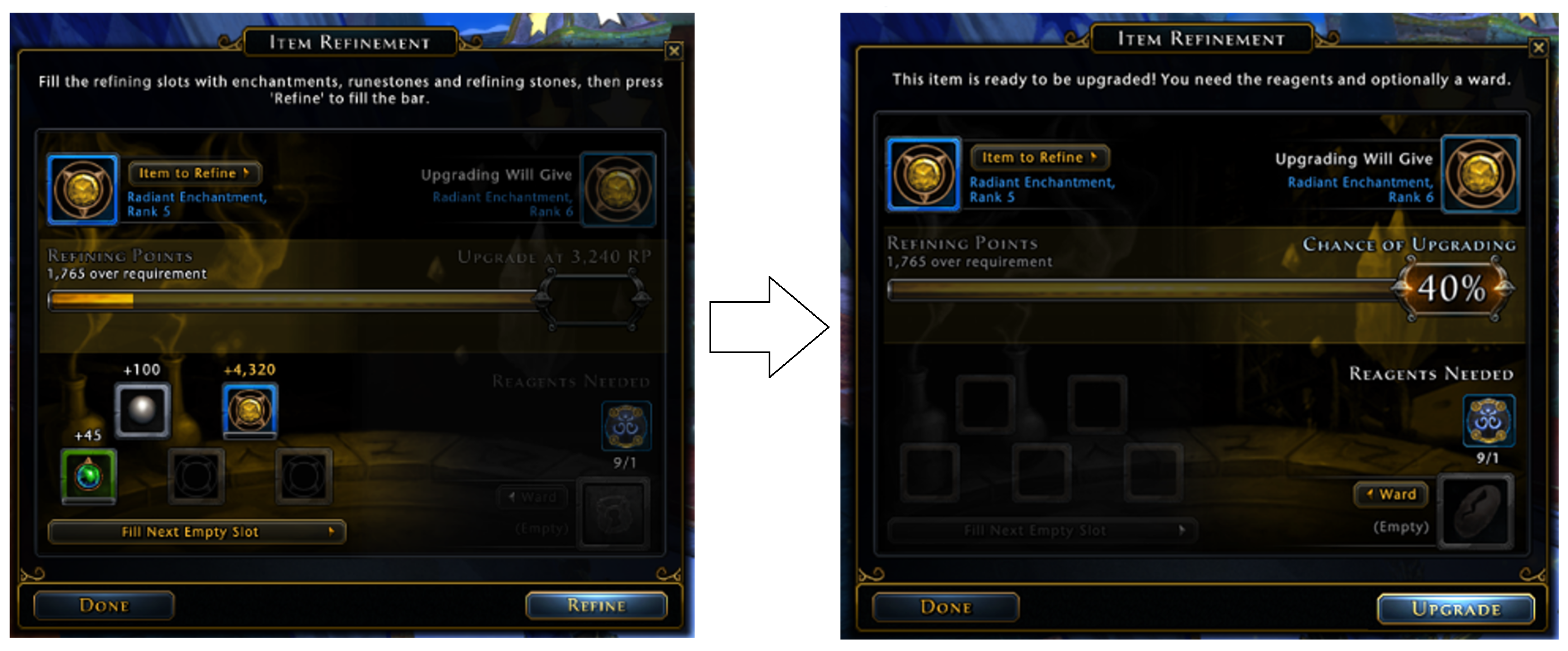
In the original system, you started with an enchantment to upgrade, and put other enchantments into the "food" slots. When you pressed the "Refine" button, these items got destroyed and filled up the "refining points" bar. The window looked like the view on the left, which emphasized the feeding, or "refining" action.
Once the bar was full, the enchantment was finally ready to actually upgrade to the next level, if you had the required "reagents." The window changed to the view on the right, which emphasized the upgrade action. The higher the level, though, the higher the chance that the upgrade would fail and lose your reagents and have to try again. You could pay for a ward to save your reagents if the upgrading failed, and you could pay real money for reagents if you didn’t want to look for them in the world.

Problem: More Types and Levels of Enchantments
Over the years, more types of enchantments and more levels of enchantments were added. Now the original design of only five "food" slots didn't handle the large number of items that needed to be used in refinement. The top level enchantments needed hundreds of lesser items in order to upgrade.
There was also the problem that new players now felt that they had too many choices. You had to destroy some enchantments to feed others, and players were scared that they would destroy a thing they’d need later, or spend time and resources improving the wrong skill. They understood how to do the refinement, but not how to make the choice.
These problems went past a UI-only solution. Re-laying out the window and re-presenting the information just wouldn’t help. The five slot limit was a technical one, and there were now 15 ranks of each type of enchantment which made the whole progression top heavy.
Solution
The entire system was changed to not require destroying enchantments to improve others. Instead, players only needed a new refinement currency, though reagents were still needed and wards were still optional. Refinement points (RP) came from destroying other inventory items, not only enchantments, but were also given as a quest reward. Turning items into RP became an option in a context menu, instead of being the central part of the feature.

Iterating On New UX Designs
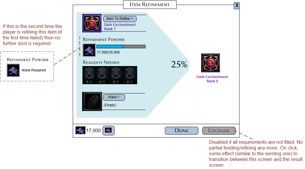
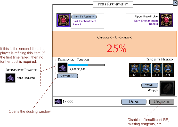
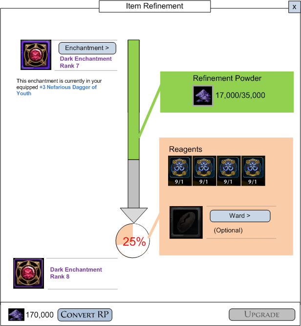
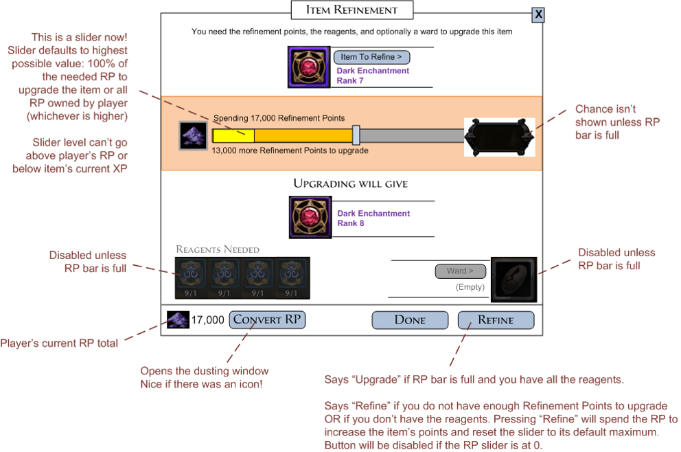
At this point we thought of a new requirement. A time-limited event in the game allowed for one free RP for every RP you spent. We thought of a use case where a player might want to take advantage of this double RP event to fill up an enchantment as much as they could, even if it wouldn’t go all the way to 100%. So we had to support a player choosing how much RP to put into the bar.
The RP indicator became a slider controlled by the players and therefore needed to be bigger. To serve both the simple case of "I just want to make this enchantment better" and the more complicated case of "I want to maximize the benefits this event is giving me," the slider defaults to 100% of the possible amount to spend.
Final Prototypes and The Implementation
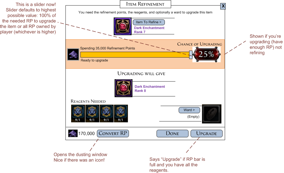
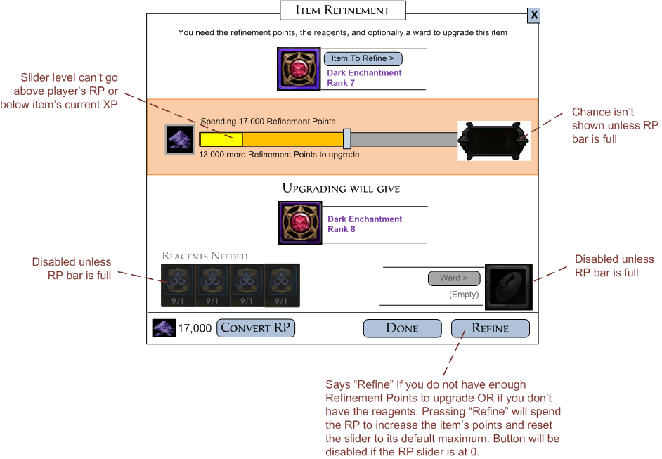
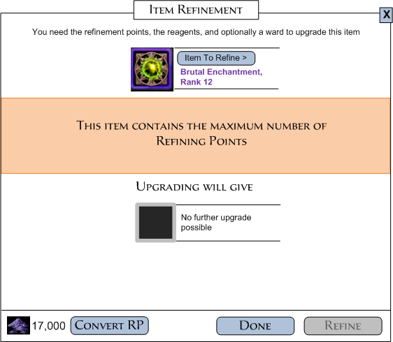
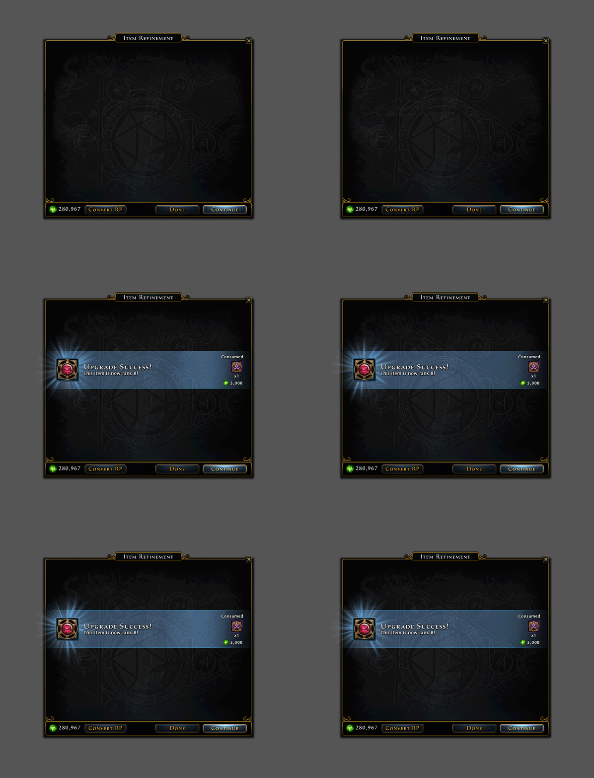
The wireframes went to the UI artist who created the in-game art and then back to me to implement.
The Next Redesign
Several years later, though, this design in turn became inadequate to keep end-game play balanced. There was also continuing sentiment from the players that there were too many enchantments and the system was overall just too complicated. Needing to attach enchantments to specific items also meant you had to get duplicates (an arduous process) if you wanted a certain effect on multiple items. The system was redesigned again, this time more drastically and once again, needed a new UI.
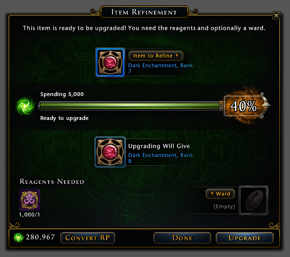
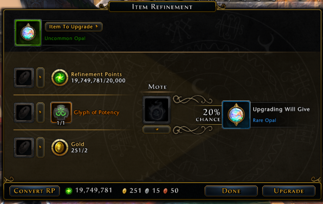
The biggest change was that enchantments longer needed to be attached to items. They became equippable items in their own right. The UI changes that this required were extensive, but are not covered here. The other major change was an extreme simplification of the enchantment progression system, so that refinement always simply meant that you were increasing an enchantment's quality level. There was no partial progression; you either had the materials to upgrade or you didn't. The materials needed to upgrade were also simplified so that there was only one reagent and one additional numeric.

One thing that got more complicated, though, was that now a player could use a ward to keep from losing any required item on failure, individually. Previously, wards could protect the reagents or could affect the success chance. Now wards only protected the materials (optionally), and a new item, a "mote", could affect the success chance (optionally).
Iterating on New UX Designs - Again
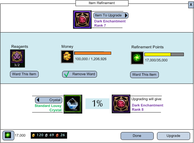
The initial idea was to just keep varying the existing UI, but the design had changed so drastically that a correspondingly large change in the UI seemed appropriate.
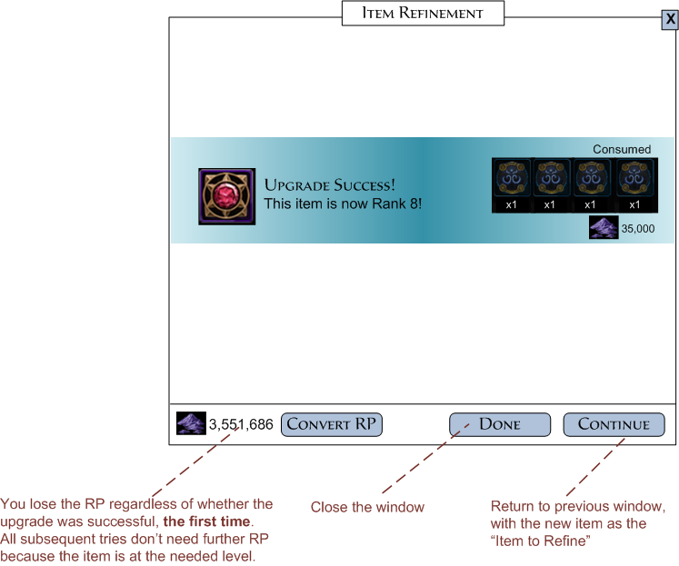
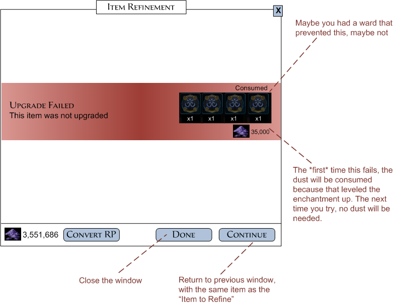
I revived a wireframe from the previous round of changes, since the simplification of the requirements made it viable again. The success/fail windows stayed the same as the previous implementation, though I added new information to show how the wards had helped. Because wards are an in-game purchase, it is important to show the player that they were worth it.
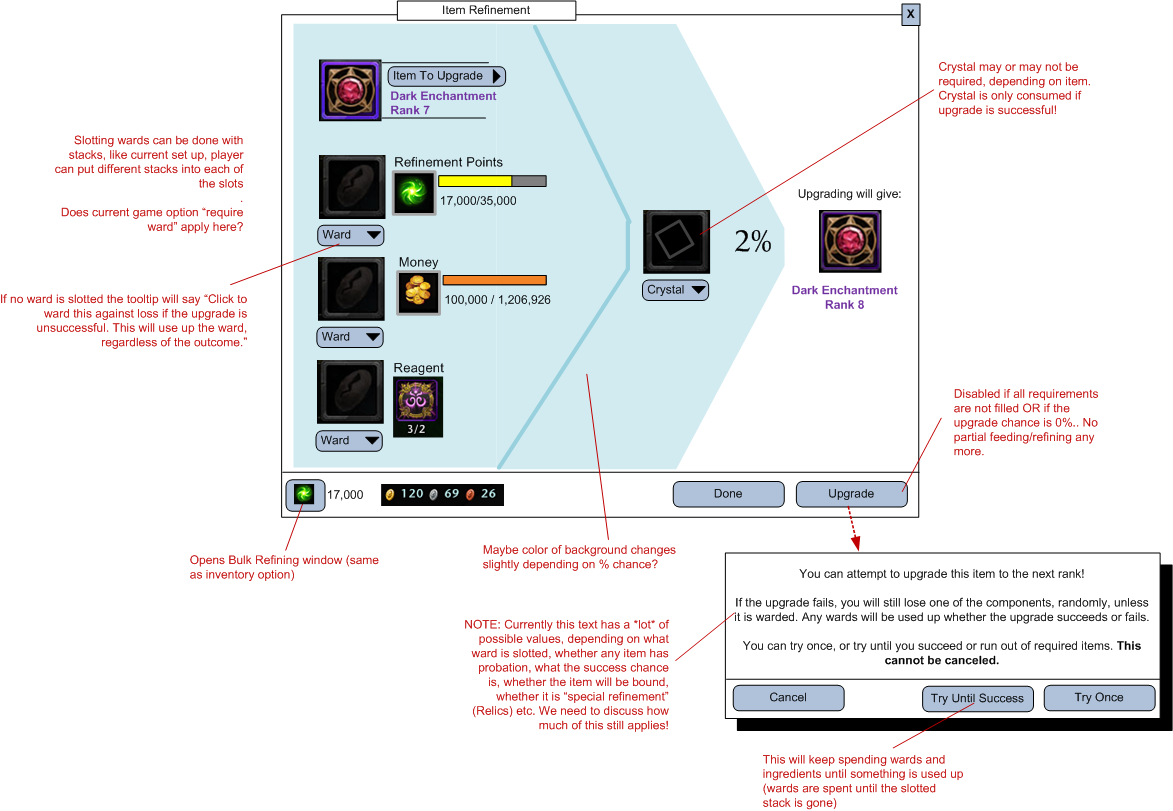
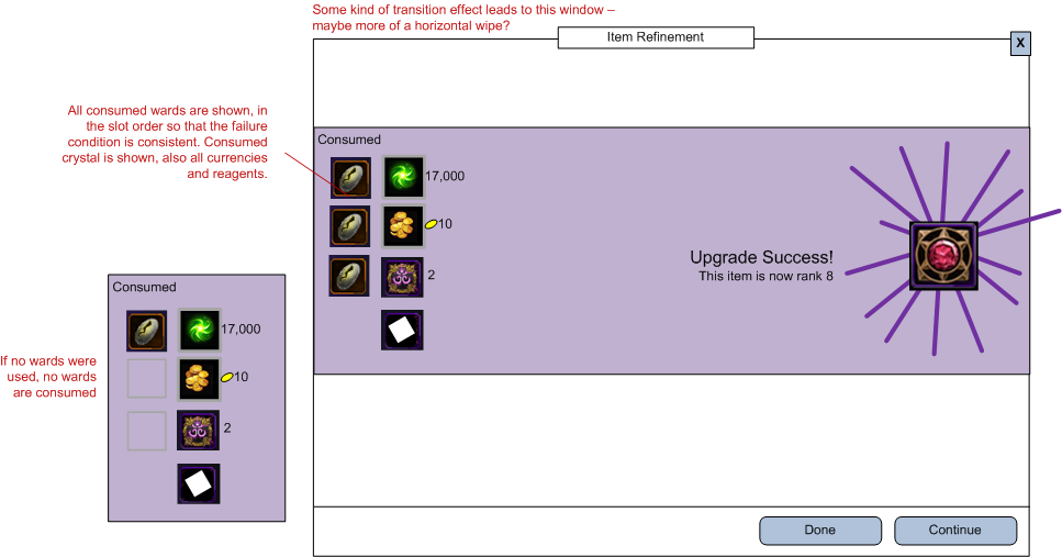
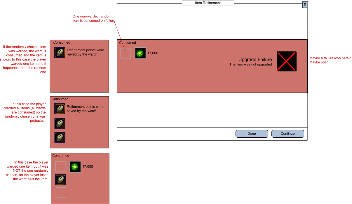
Again, the wireframes went to the UI artist for iteration on the final appearance. This screenshot is of the current game and this design has lasted for eight modules (about three years).
Conclusion
There were many other UI/UX designs that needed to be updated because of the sweeping system changes I've described. As mentioned, there was the new display of sixteen new equippable enchantment slots. There was a flow for converting items into RP both individually and in bulk, with a variable success rate that needed a fun reward display. There were variations of the refinement windows for items that could also be refined but in slightly different ways. There were the decisions about handling enchantments that were now obsolete but into which the players had invested time and resources. But this focus on one flow illustrates the typical changes that happen over a game's lifetime and the UX challenges that result.
