Zen Market Information in Neverwinter
Neverwinter is a free to play massively multiplayer online roleplaying game that was launched in 2013. That longevity means that the game has needed to constantly change and grow to meet the expectations of the players. It also means that new players' experience must constantly be balanced with the end-game players' experience, as the end-game is also becoming more and more complicated.
The Zen Market is where players spend Zen, which is an in-game currency. The only way to get Zen is to spend real-world money, or to trade the game's time-based currency for it, so it is valuable. We want to make sure that players can spend their money wisely and feel like they're getting their money's worth.
Two items in Neverwinter that increase your effectiveness are mounts and companions. While you can get most mounts and companions from lockboxes, there are some that you can only buy from the Zen Market.
Please note that I created none of the actual art assets shown here, only the wireframes/low fidelity prototypes.
Original UI
The original Zen Market used the same detail page for every item, whether it was a mount, a companion or another item. Mounts and companions have much more information that any other item, and technically it was all accessible by selecting the inventory item in the Zen Market detail page and inspecting it. However this was pretty hidden functionality considering how important this information is to players considering a purchase.
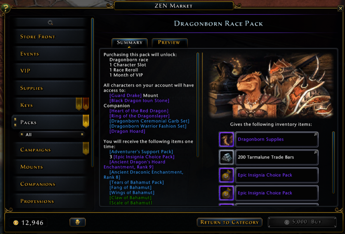
Normal Zen Market detail page: One Zen Market purchase gives multiple inventory items.
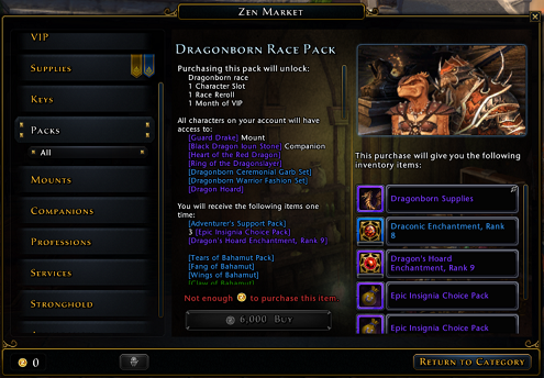
Mount detail page: One Zen Market purchase gives a mount "pack" item that must be opened by the player to actually equip the mount. Inspecting the inventory item gives mount information.

Companion detail page: One Zen Market purchase gives a companion "pack" item that must be opened by the player to actually equip the companion. Inspecting the inventory item gives companion information.
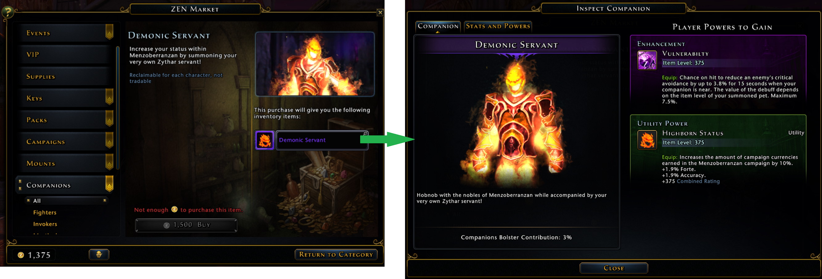
The mounts and companions looked boring compared to other Zen Market items; their functionality and appeal was hidden in a popup. There were technical reasons why having every Zen Market item UI be identical was easier, but as mounts and companions became a more important part of the game it was worth looking for a better solution.
Solution
We needed to take all the information from the inspect windows and have it easy to find in the detail page. The most important information to the player needed to be immediately visible without having to further click. The animated headshot also needed to be displayed immediately since it was a more visually appealing (and accurate) representation of the mount or companion than a static item icon.
However, there was more information than could be displayed at once in the detail area so I divided it into subtabs. The default (first) tab had the most important information and the headshot, while the other tab(s) had information that a buyer might still want to see, but not initially. One consequence of this was moving the "Buy" button down into the footer, so that it would be visible no matter which subtab you had selected without taking up valuable space inside the subtab pane. Fortunately there was space in the footer.
Because this design was about showing existing information in a different (but existing) context, I used mainly screenshots with some wireframe elements rather than re-creating the entire design in wireframe form. This was quicker and also has the advantage of clearly showing which parts are new.
Mounts
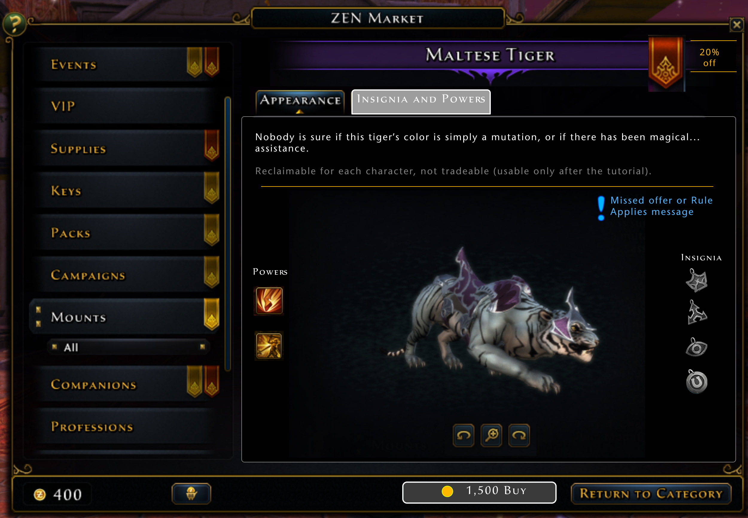
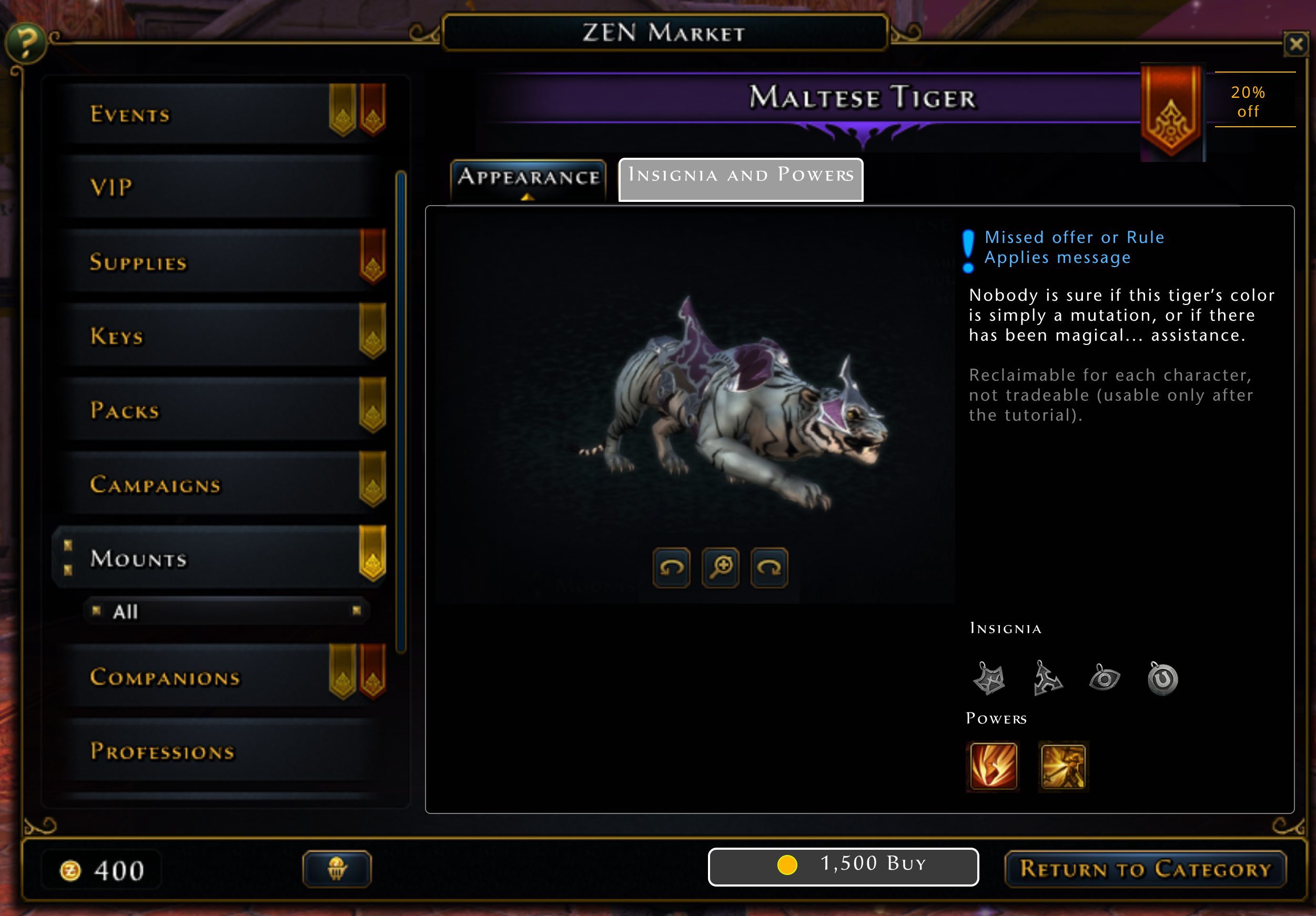
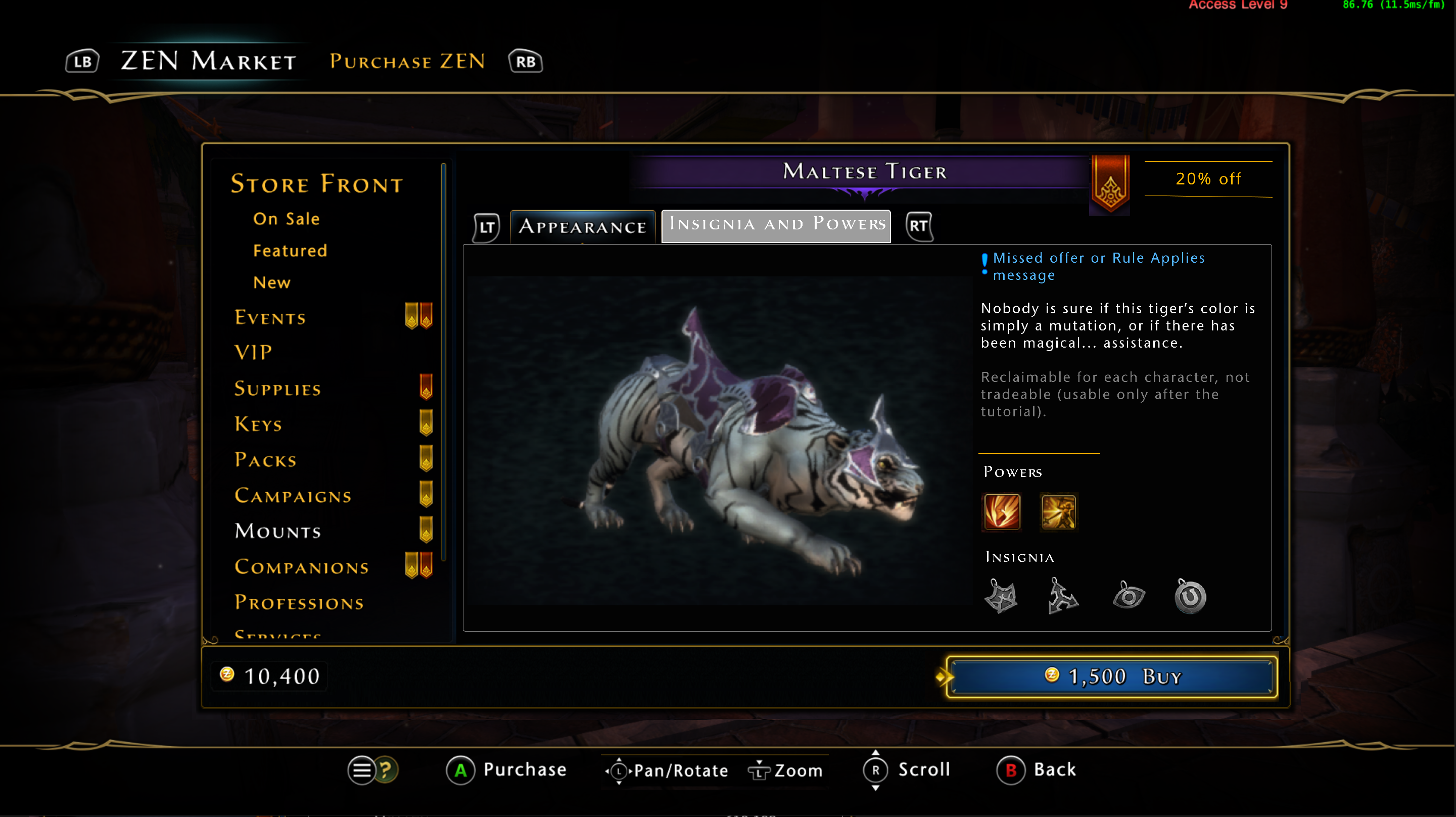
After discussion with the system and content designers, we chose the most important information about a mount. I then moved the information around the space, looking for a balanced layout that would handle a variable amount of text and icons. The headshots of mounts tend to be "landscape mode" (wider than they are tall) since mounts tend to not be bipedal. The first design on the left made the headshot as big as possible, which was good, but the text was hard to read when it was the entire width of the page, and a vertical arrangement of the insignia and power icons wasn't consistent with the rest of the game.
The second design on the left meant that the headshot was a bit smaller, but moving all the other information to an adjacent column gave it more space and emphasis. This layout was the one that was chosen for implementation. since it also translated to a console layout better than the first design. On the fixed resolution of a console, vertical space is at more of a premium than horizontal space. Stacking subtabs on top of the text on top of the headshot reduced the headshot size too much.

The second tab was simpler since there were only two lists of information to display. While the pane is capable of scrolling, all existing mounts' information could fit without needing to scroll (even when localized).
Companions
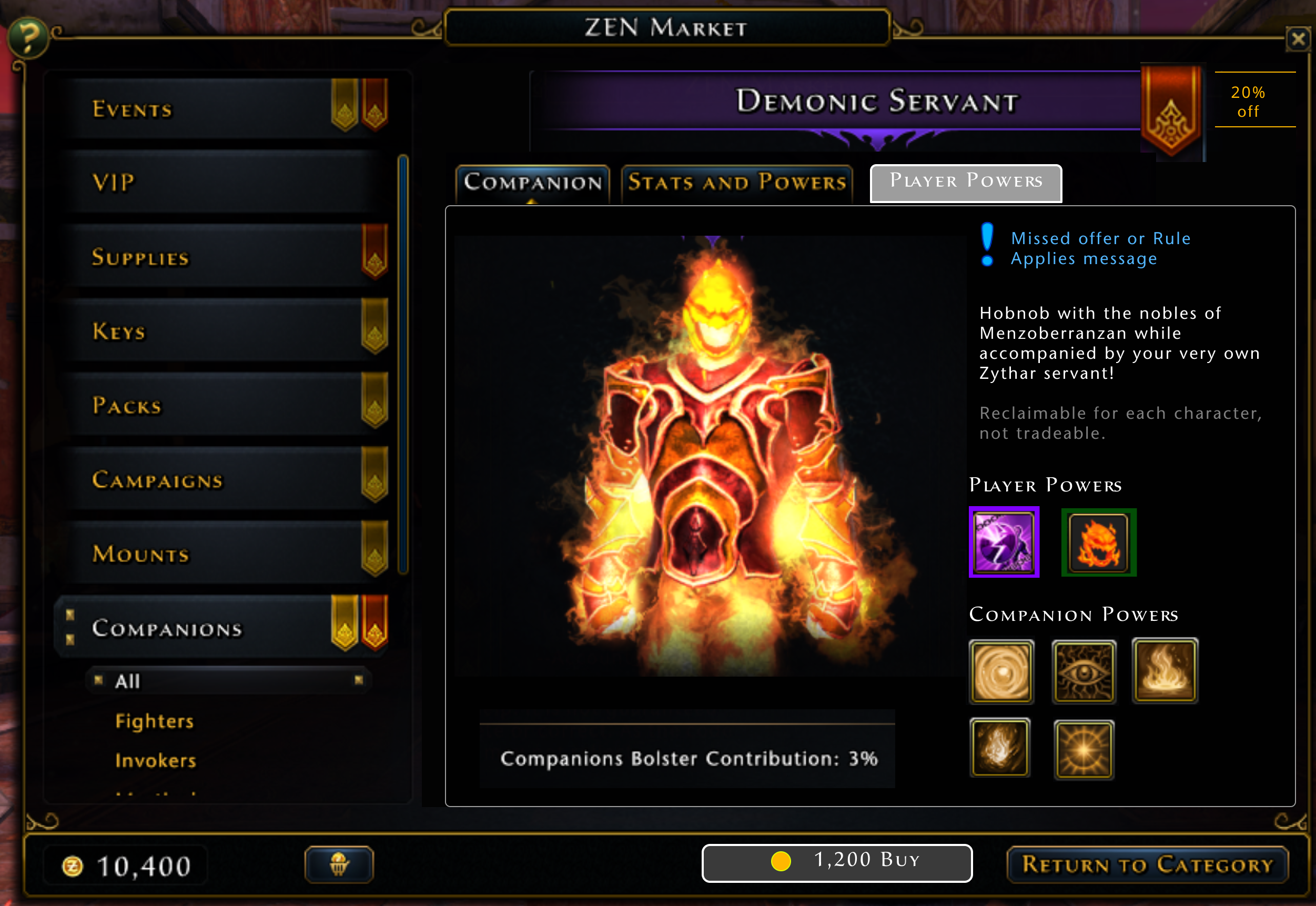
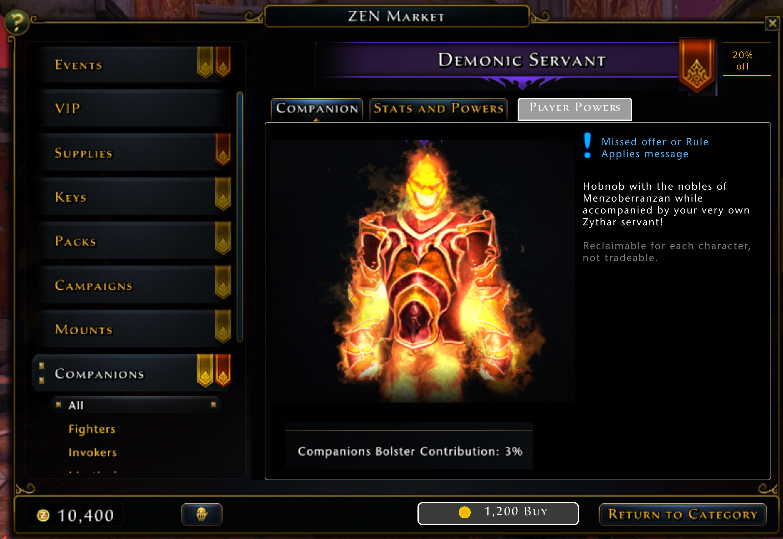
As with mounts, we discussed the most important features of a companion to put on the front page. However the number of powers that you get from a companion tends to be larger than mounts, and the powers themselves are more complicated, with longer descriptions. Even in icon-only form, adding all the powers made the page fairly cluttered.
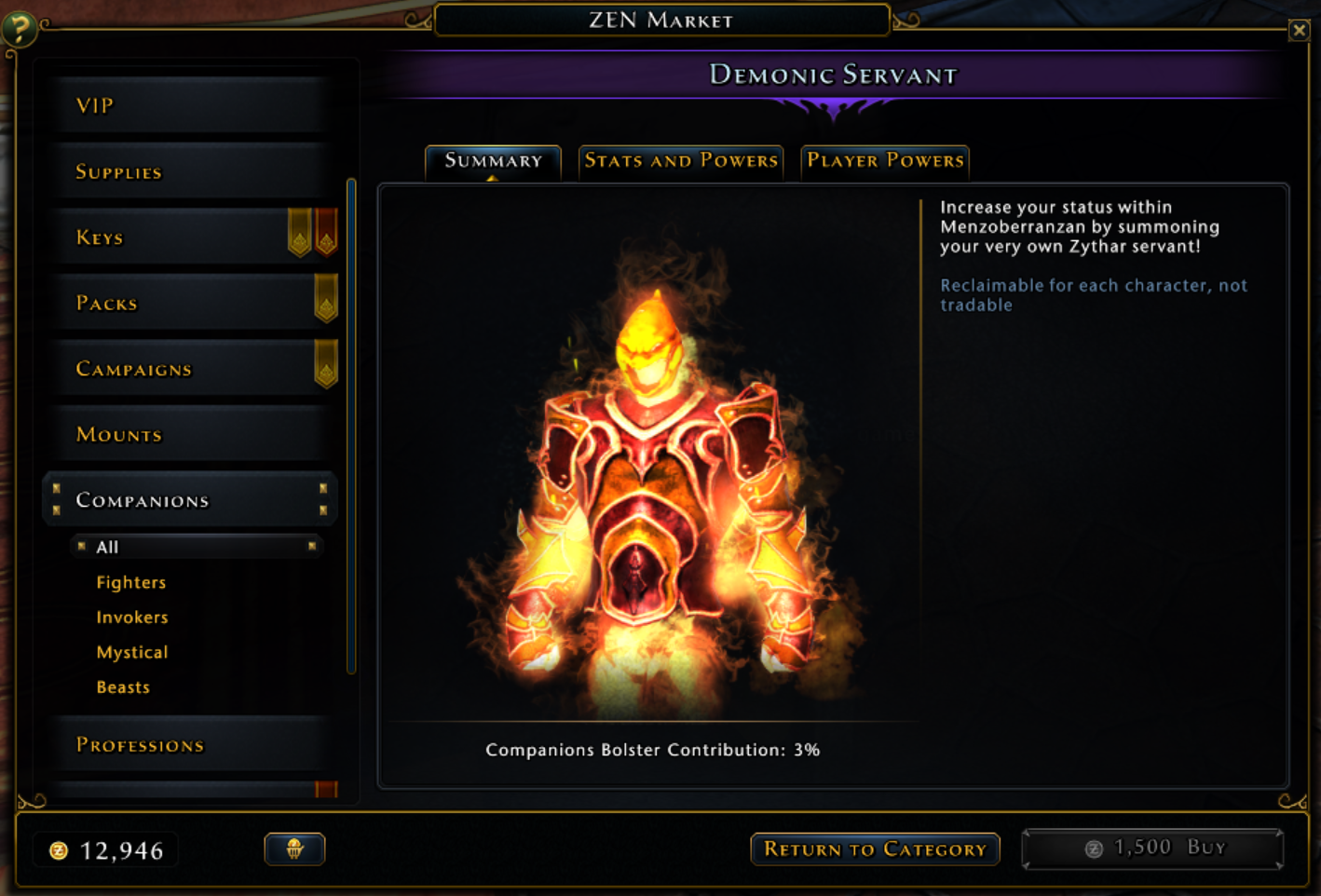
There was a lot of discussion, but we finally decided to keep the first page as the headshot and the description only. In retrospect I think we should have kept only the player powers listed as icons, to have consistency with the mount display.
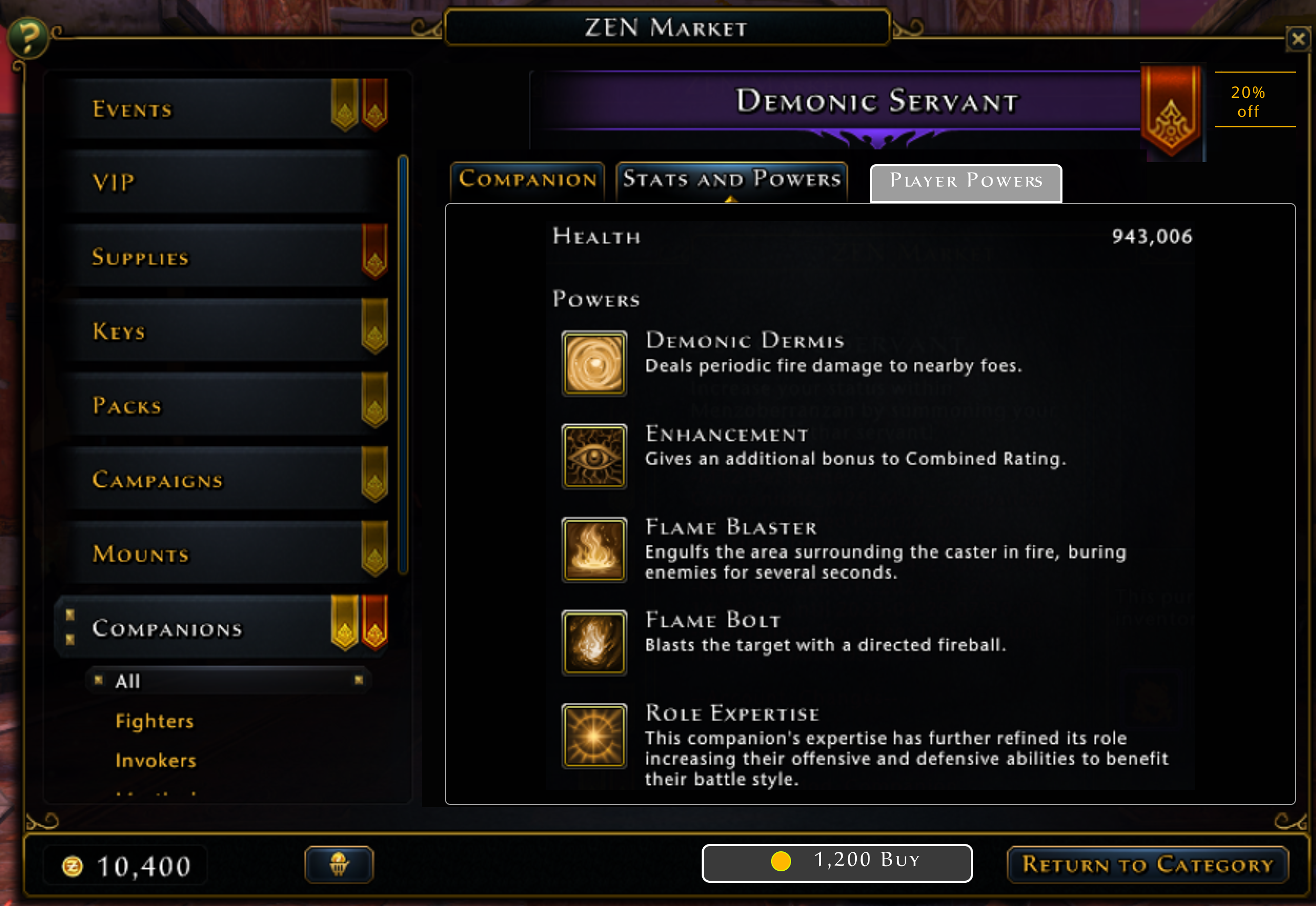
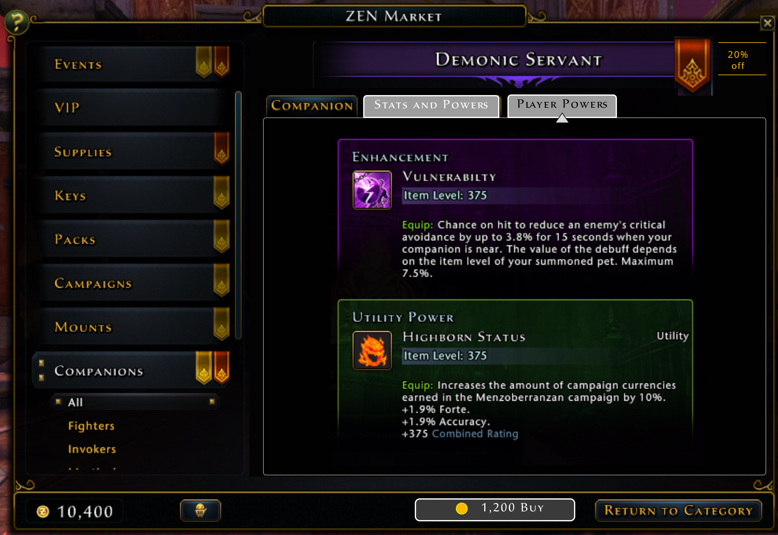
The next tabs were simpler since we could just use the same information and layout as the inspect window directly. I did try combining the two pages into columns (not shown) but that was unanimously voted as overwhelming. Having the details area as subtabs made just adding a third subtab simple.
Other Items
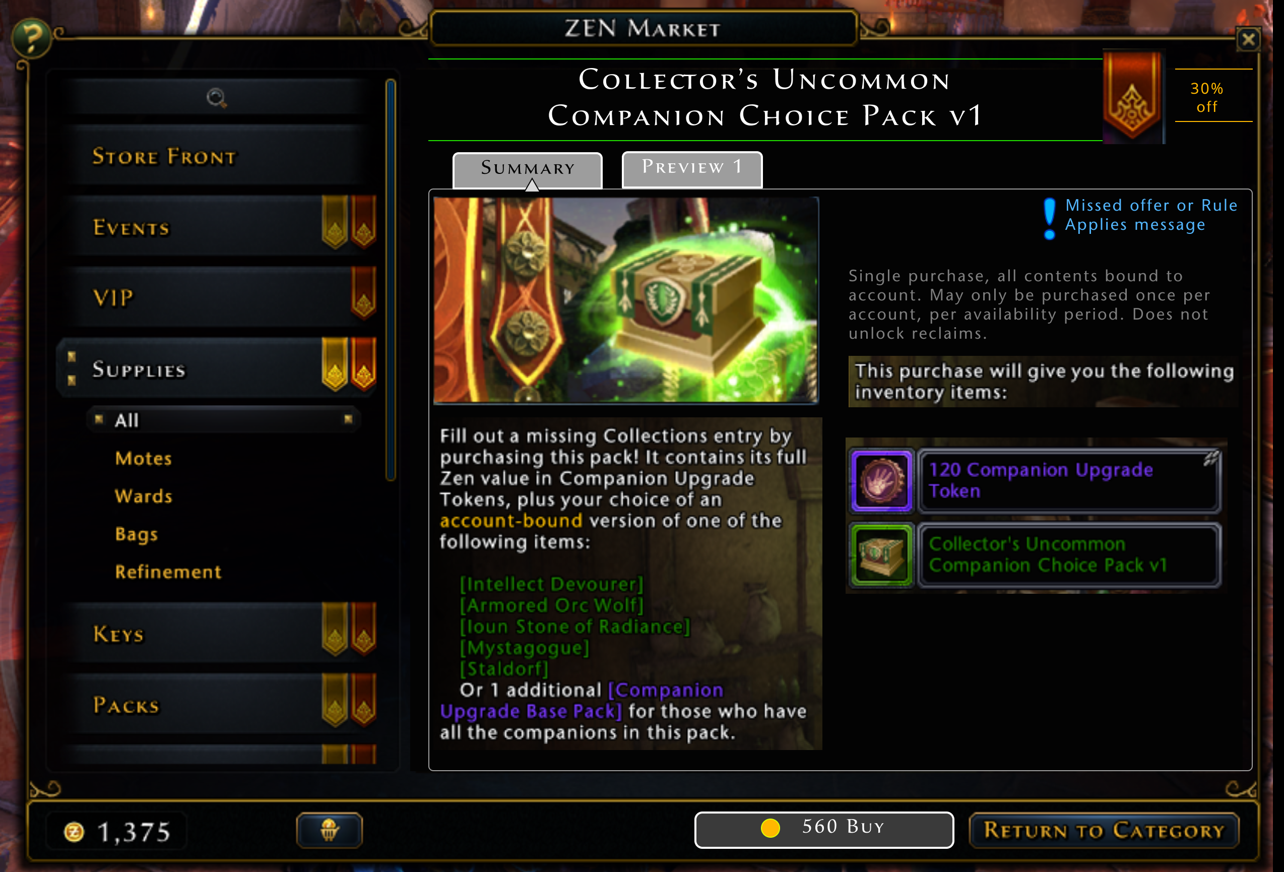
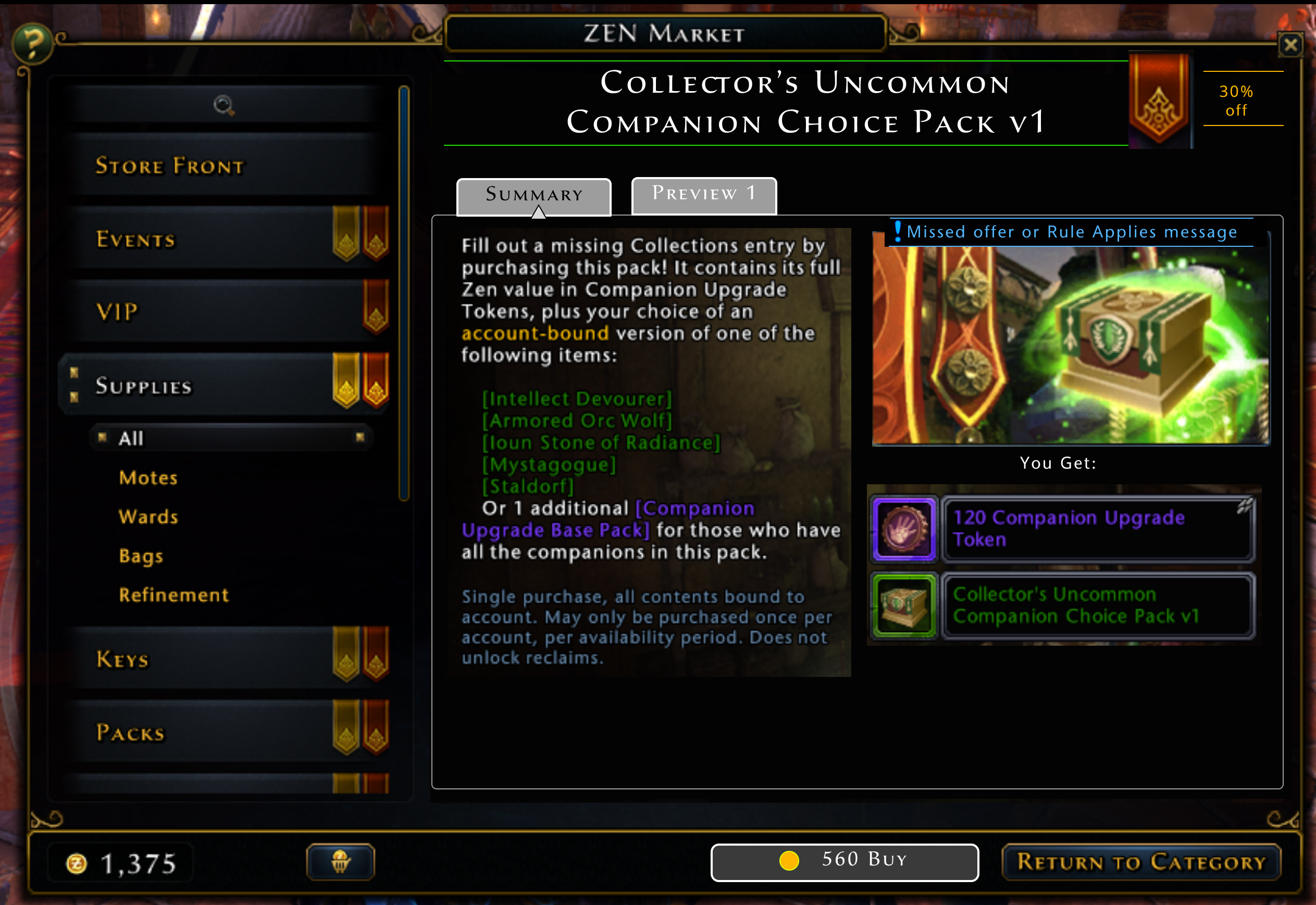
While I did far less work on redesigning the UI for other Zen Market items, the concept of using subtabs still had advantages. It made the layout consistent with that of the new mounts and companions, so that switching between items was smoother. I did experiment with moving the elements of the first tab around (top picture) but ended up with deciding on a layout that was more similar to the original (bottom picture).
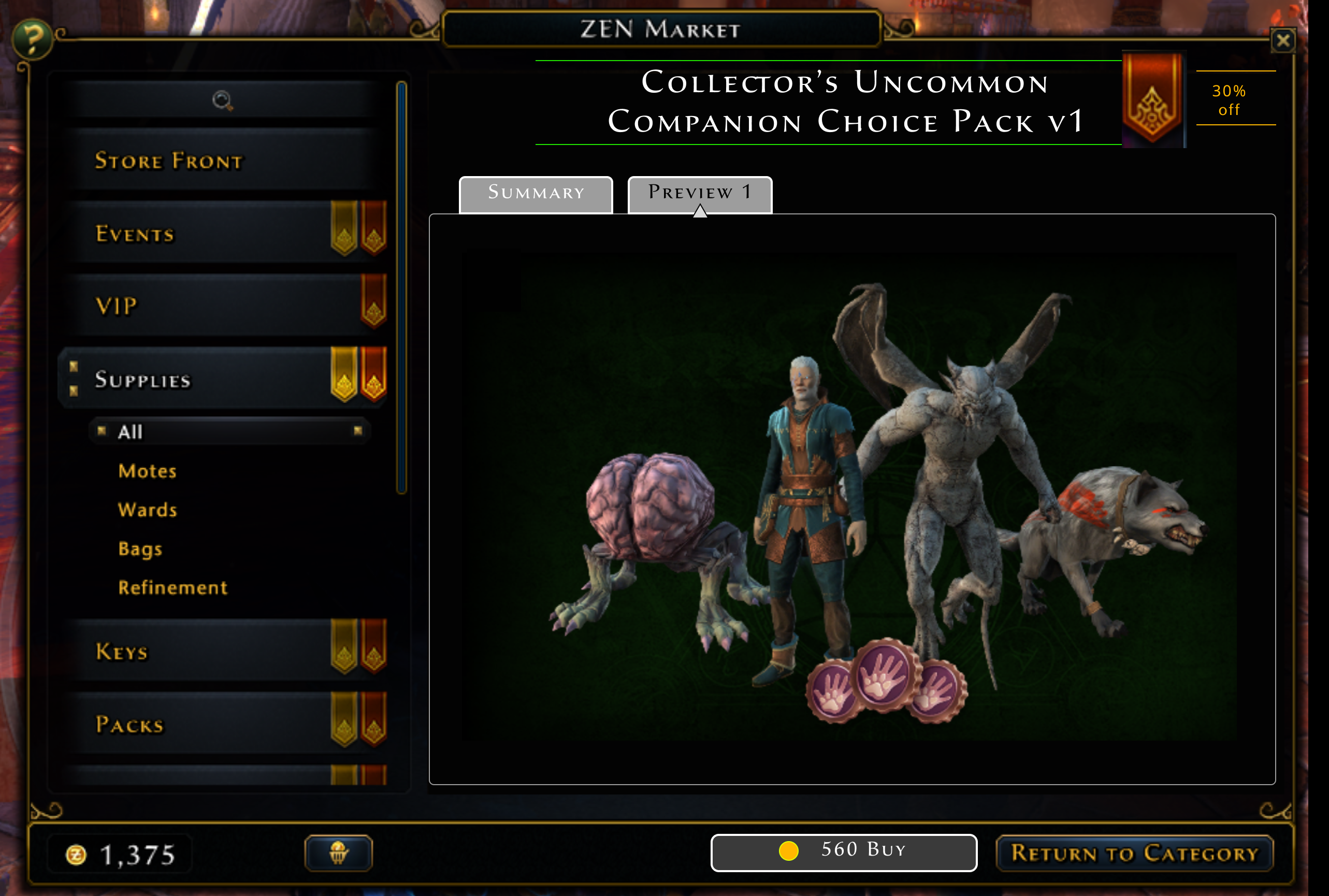
These other items occasionally had hidden extra information also. For some of the larger, more complicated items like packs, we had "Preview" art. This was extra concept art in addition to the normal advertising art. Originally the existance of this art was messaged by a small icon overlaid on the normal ad art, and clicking on the normal ad art showed the preview art in a popup. I doubt that many players found it.
Technically it is possible for a Zen Market item to have several pieces of preview art, although currently none do. But the subtab layout allows multiple preview images to each have their own subtab (this will happen automatically as preview images are added), and they can now be accessed far more clearly. If an item doesn't have preview art, it will only have the "Summary" tab.
Conclusion
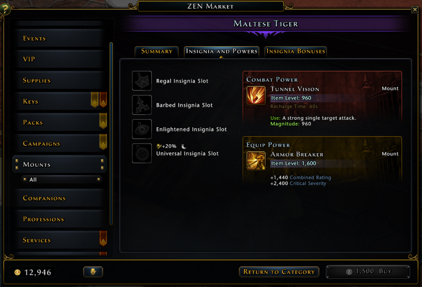
The implementation ended up being very close to the mockups, with the UI artist just adding better separation and adjusting the spacing and layout slightly. We switched the position of the "Buy" and "Return to Category" buttons in the footer, since the corner position is the one with the most emphasis.
After the initial implementation, I got feedback that for the mount display, it would be handy to see the insignia reference guide. This is a list of which combinations of insignia equipped on a mount give you bonus effects. This guide is available in another game window, but having it at the players' fingertips here would be convenient. Because of the subtab layout, adding a third tab to the mount display was easy.
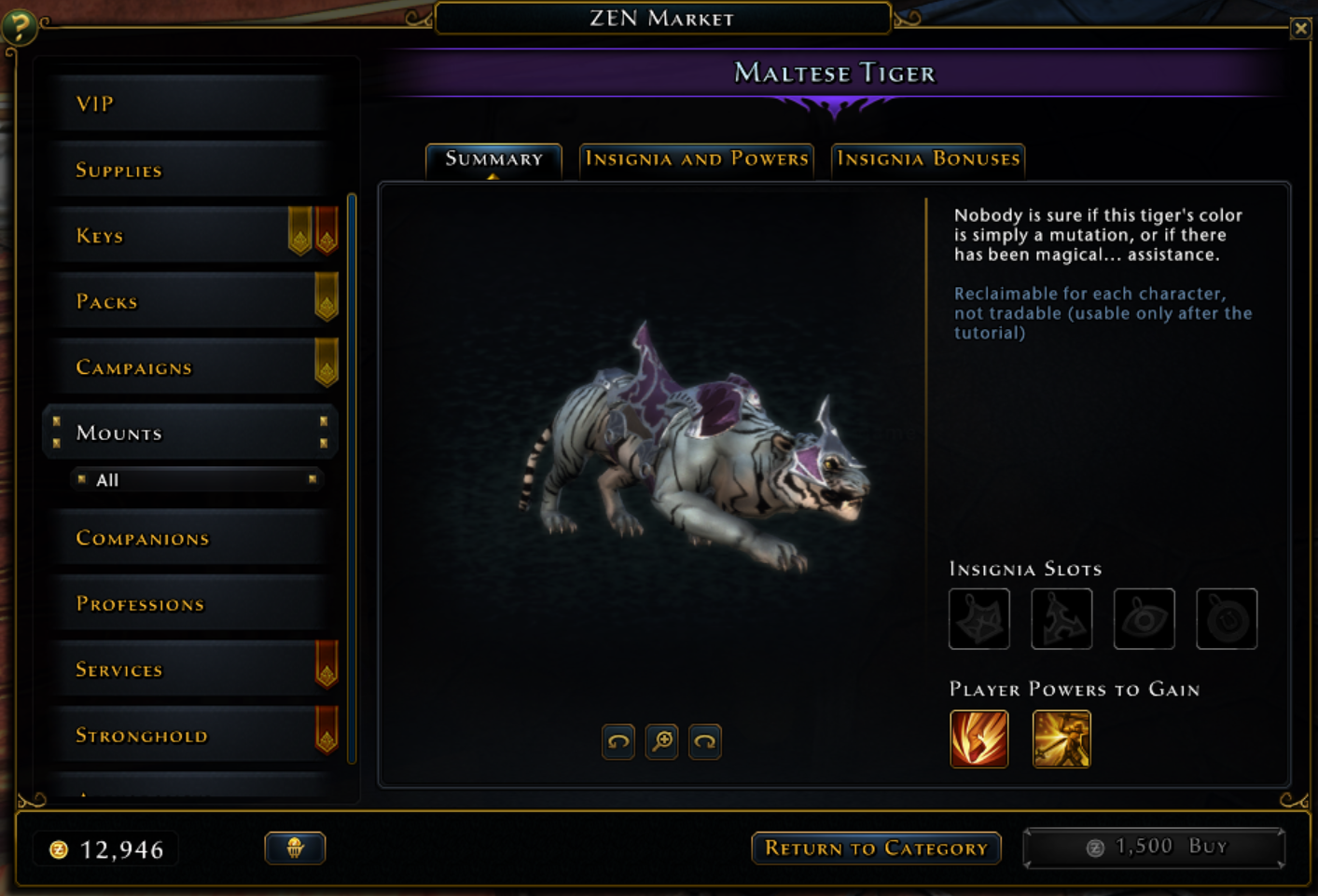
Another example of improvements from the UI artist was changing the layout of the second mount tab. We removed the header for the player powers, since the title next to the tab was redundant, and aligned both lists to the top. Iteration like this after the implemtation happens constantly, both after internal testing and release to the players.

